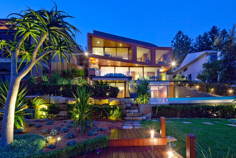
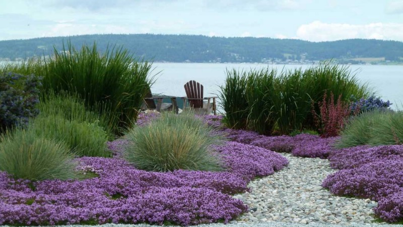
Perhaps one of the most overlooked areas of home interior is actually the exterior. For some, constructing the perfect outdoor space is a labor of love. Others strictly prefer leaving it to the professionals. Within this collection of private yards, gardens and backyard spaces you will find design layouts that appeal to the eye and stir emotion. Tranquil, outdoorsy and utilitarian are the three main words that can be used to describe the perfect backyard design collection. Tables and chairs seemingly appear out of nowhere, carefully placed amongst the trees. In other cases, it is the great outdoors that looks to be encroaching on a comfortable living space. Whatever your personal tastes, new and original concepts can be borrowed from these examples.
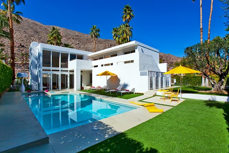
The palm trees frequently found around the San Jacinto mountains are ever present around this spacious California mansion. The in-ground pool tempts viewers to test its temperature with their toes, whether its warmed by the sun’s rays or illuminated in soft hues in the moonlight. Large, stone slab tiles block out the common living areas, complimented by clear white walls and floor to ceiling windows. Bright red chairs and geometric patterns are used to break up the white walls. In the bedrooms, long, rectangular windows shapes the natural lighting. Decorating large spaces like California mansions takes time, effort and ingenuity. Opting not to paint the walls, the designer of this San Jacinco mansion chose to capitalize on the square footage in an effort to maximize the vast, open spaces.
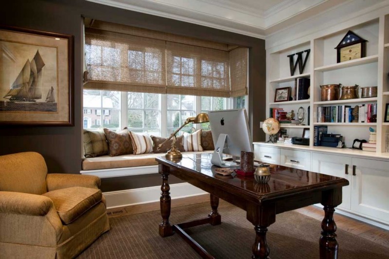
Only in recent years has the home office came out from the walls, making it acceptable for homeowners to place their workplaces in common areas. When space is an issue, home offices can spring up next to countertops and in spare bedrooms. Browse this collection of tastefully crafted home office spaces and come up with a few ideas of your own. Home offices work best in spaces where storage is ample. Desks can be purchased or constructed to meet specific dimensional requirements, and CPUs and wiring can be cleverly hidden. Adding a handful of colorful accents, such as flowers and personal photos will not only make your home workspace complete, it will give you access to a world where peace and relaxation becomes second nature.
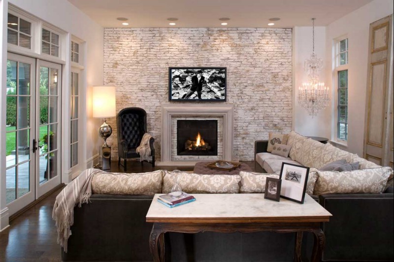
There’s something about a well furnished room paired with a brick wall. Since the 17th century, brick walls have been commonly found in residential structures. Many of these homes have been renovated to modernize their living spaces, leading to many variations of how brick walls are handled in contemporary interior design. Leaving brick walls untouched, especially the red brick wall, can help to create drama and contrast. Painted brick walls are more subtle. Their interesting textures draw attention to them, but not in an overt way. These pictures of brick wall interiors include kitchens, living areas, dining rooms and bedrooms. If you are not sure how to tastefully decorate a room with a brick wall, take note of how others have tackled this problem with grace.
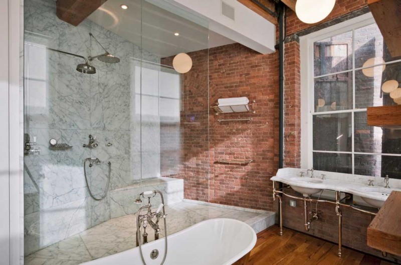
These photographs show how the goal of preserving the original essence of a brick wall while adding modern elements can be achieved. Tiles, smooth chrome bathroom fixtures, tall glass shower doors and recessed lighting typically appears in bathrooms with brick walls because these items make bold statements. Designing with the brick wall in mind necessitates strong pairings and a clear vision. The more modern take on brick walled bathrooms go a step further. Some of these bathrooms have bricks inlaid on the walls, on the bathtubs and even form archways. Other organic accents, such as marbles, wood and plants work with the brick, never against it. Use the photos below to learn what the perfectly designed bathroom featuring brick walls looks like.
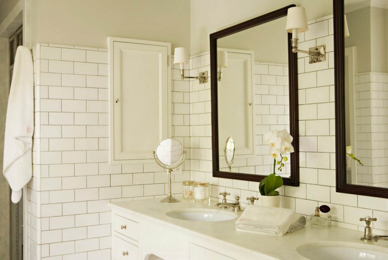
What it is about white bathroom tiling that is so quintessential. White tiles in the bathroom looks so clean that it can also become clinical if you are not careful. For new concepts on white tiled bathrooms can consist of, review our selection of photos. White tiled bathrooms appear both sans color as well as with muted accessories. In addition to having white bathroom tiling, these functional spaces also pay careful attention to lighting. Bathroom vanities that emit soft lighting, chandeliers and skylights can be used to make white tiling become more prominent, or downplay its sharpness. Choose towels, rugs and soap dishes that double as unique conversation pieces for even better results. The white tiled bathroom is still as exciting as it ever was.
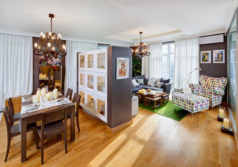
At first glance, some design elements just don’t seem to go together. This Kiev apartment prominently utilizes shapes, colors and patterns that are not usually found together. In the halls, colorful paintings hang on sponge painted walls. Light wood doors and hardwood floors make these combinations pop. A pillow from a patterned lounging chair has been placed on the couch, which helps to highlight the designer’s true intentions. In the collection of pictures featured block colors and contrasting patterns, the main theme that carries over is layering. Choosing a single color and a single pattern just won’t due if you really want to present laying in an interesting manner. Combining dynamic colors and smart patterns can take an apartment to take on a life itself. Project and photos ID4U.
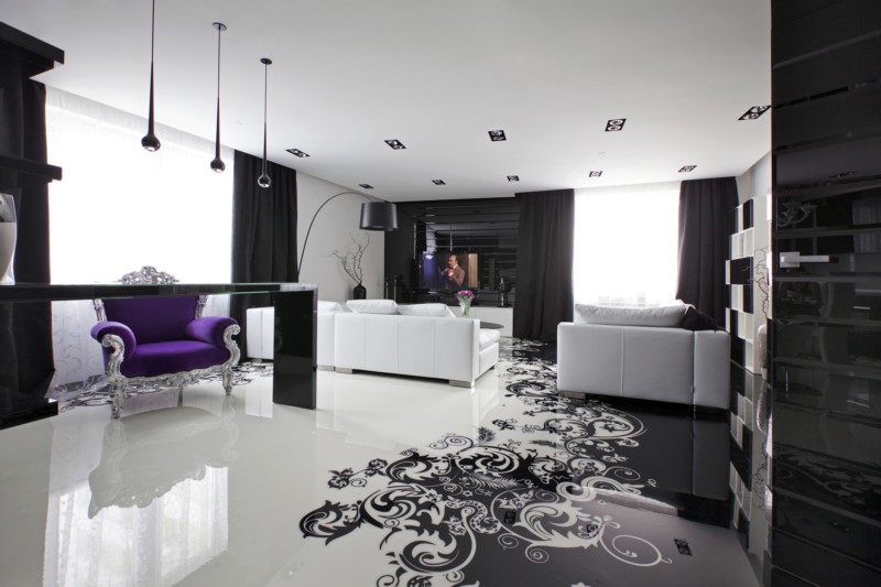
Black and white interior décor, presented with and without additional color, is a classic way to show minimalism. Geometrix Design has perfectly executed a minimalist luxury apartment. With the palette set in only black and white, the design firm was able to concentrate on shape and texture. A white bed sits fixed to a black, textured headboard in the main bedroom. More white furnishings are juxtaposed near pitch black curtains, helping the room to maintain the careful balance. A lone purple chair appears in the living room, causing the otherwise monotone room to become more three dimensional. The two main colors used in this luxury apartment make varying statements depending on whether they have high-gloss or matte finishes. Both quiet and sweeping, these minimalist black and white apartment photos deserve attention. Designed by Geometrix Design
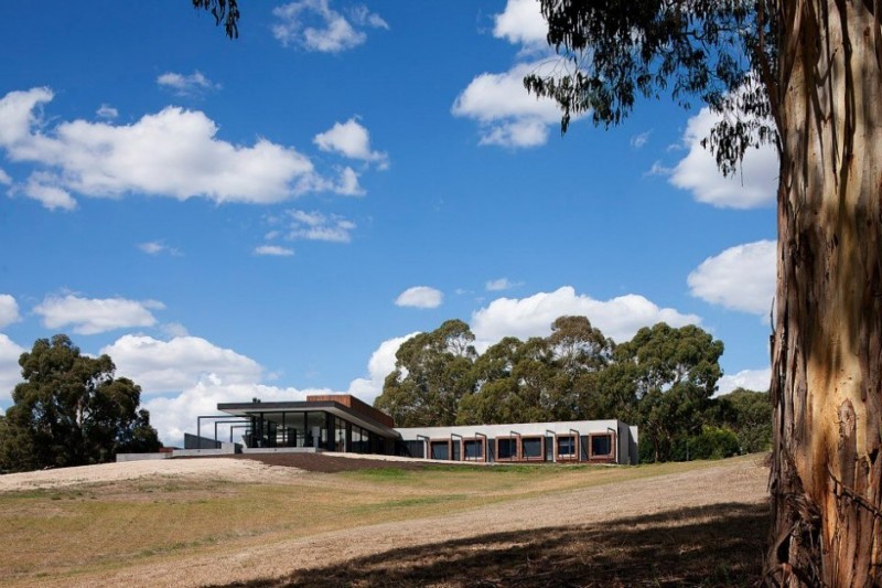
Made up of three large wings, a prominent structure in the center of the home is comprised of glass, concrete and metal beams. Although the glass is not tinted, views of the interior are shrouded in shadows, due to the unique architecture outside. Completed in 2012, Rachcoff Vella Architecture, this home takes on varied modern elements to create a structure that is visually stimulating. The kitchen and dining area are surrounded by light on all sides, as it comes flooding in from the floor to ceilings windows. At the far end of the center wing, an entertainment trimmed in black sits lost to the ground. A built-in fireplace and flat screen TV appear close to a comfortable chair and overstuffed couched. The unusual home, with its glass structure and convex walls challenge everything you think interior design represents.
Large windows are cut out of the front and back of the home, lined up like blocks on all three floors. Created by Turner Studio for a client in Australia, the beautifully landscaped backyard consists of an in ground pool, luxurious outdoor lounge area with plush couches a stone accent walls. Amber colored outdoor wall torches bath the outdoor lounge in golden light. On one of the many patios that appear just outside of the home rests a black dining room table and chair set. An impressive stainless steel grill sits nearby, indicating that the occupants thoroughly take advantage of the warm weather. Across three floor of front and backyard balconies, the rails are made of glass alone. The effect is an exterior that reflects light in a myriad of ways.
