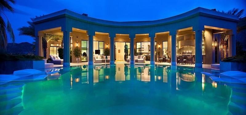
With first class style and Hollywood like construction, this luxury home is located in Palm Desert, California, USA and was painstakingly designed and built by Gordon Stein Design. The exterior of the house has a very intriguing Moroccan style that is evident from the framed windows and elaborate roof rims. The stone that has been used to create this almost palace like home also adds to the Moroccan theme. The house has amazing views of the surrounding mountains thanks to its location on the highest hill of the nearby canyon, and the abundance of palm trees make you feel like you are away on a Middle Eastern holiday, soaking up the sun with a cocktail or two. The interior is breathtaking, with such sumptuous textiles and amazingly detailed walls, it is an absolute palace fit for a king.
There’s no boat at the dock, but this lakeside retreat still provides the quiet enjoyment that its owners require. McClellan Architects had to overcome numerous obstacles in order to build a stable and aesthetically pleasing home on the lake. The lakeside retreat is located on a steep incline. In order to compensate for this, McClellan Architects signed a concrete platform and a set of front steps that will help to provide a more level work site. The entire front of the home is open. Open windows, an open front patio and a large sliding glass door that leads to a secondary wing of the house. Inside, the house has a decidedly Art Deco feel to it. Funky statutes lounge lazily alongside the soaking tub while looking out over the lake.
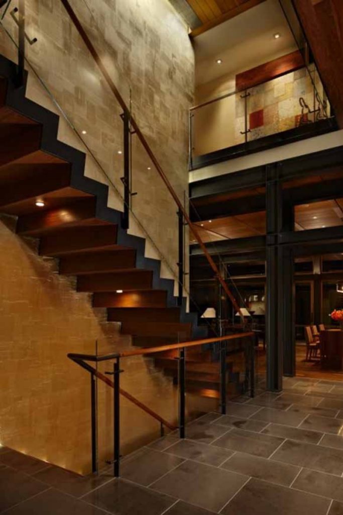
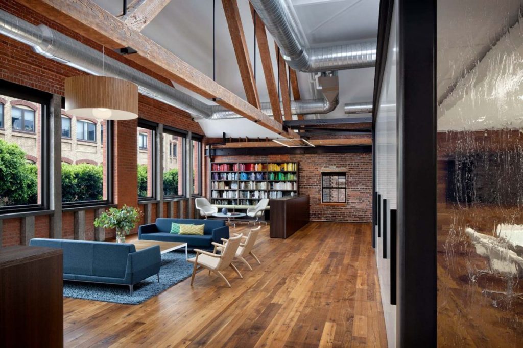
This contemporary office interior is a perfect example of modernism using raw materials. Huntsman Architectural Group designed this interior for a corporate office in San Francisco for company, Tolleson. Before this magnificent re-vamp, it was a timber warehouse with little design and limited features. The designers at Huntsman Architectural decided to utilise some of the original beams and wooden features and add metal structures to give it a more modern look and feel. The result of this renovation is staggering, with gorgeous glass partitions, metal framework and raw wooden walls and structures, the office feels warm and cosy, as well as contemporary and rustic. The decor really helps to give this place character, while the paintings and art on the walls create dynamism and individuality. Artists Rex Ray and Barry McGee.
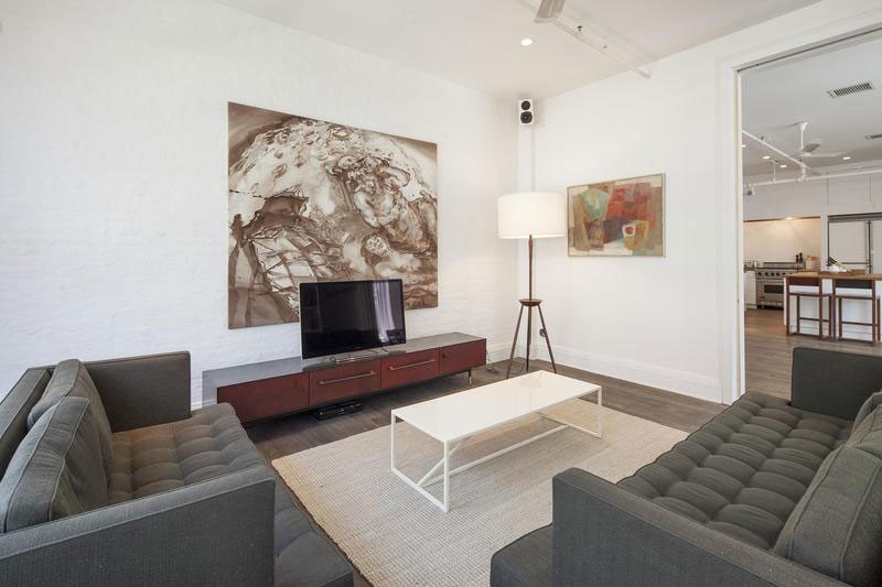
Very few bold colors appear in this residential living space in Manhattan, but its design immediately makes you take notice. Raised ceilings have been combined with painted brick walls, featuring wide open spaces and extremely clean lines. In the dining room, space has been so neatly arranged that the area could be mistaken for a museum. Bright light enters from two long windows left bare. The bedroom displays a marked change of pace. The brick walls are painted a neutral gray, and the wood accents are a slightly darker hue than the rest of the home. The centerpiece of this SOHO apartment is the bathroom, where marbled tiles and whimsical designs take hold. Featuring a deep soaking tub and a glass lined shower, modernism, minimalism and industrialism blends together perfectly.
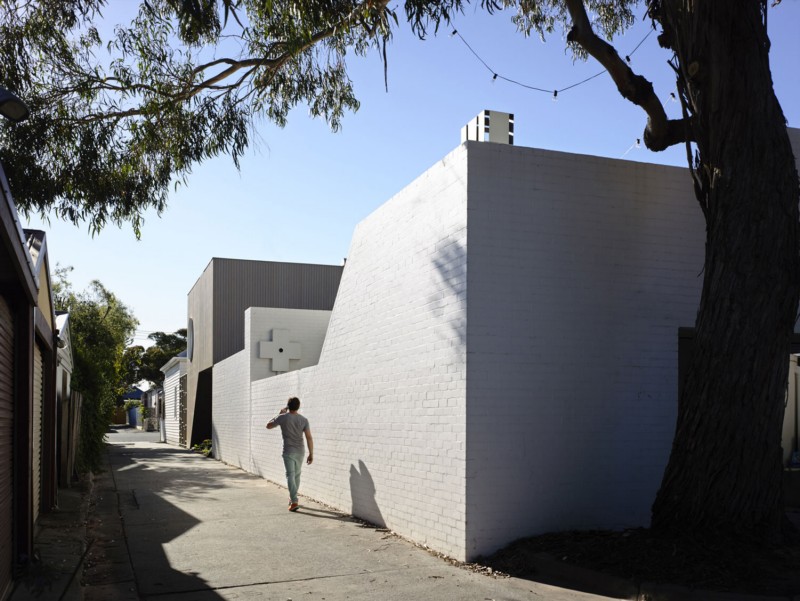
This recently constructed home in urban area of Australia has an exterior that is exciting, but the interior is truly a surprising work of art. Created by Kenney Nolan Architects, exquisite details in the very front of the home provide clues early on. Soft white lights have been strung up on a large tree positioned close to a rooftop area, add a tranquil quality that is not missed by visitors. An intimate outdoor recreational space consisting of a small fireplace and two folding chairs is found tucked away, seemingly in its own unique world, just beside a staircase. Floor to ceiling windows seem to make an appearance in every room, almost initiating a game of peek-a-boo with the home’s many defined outdoor recreational spaces and detailed walkways.
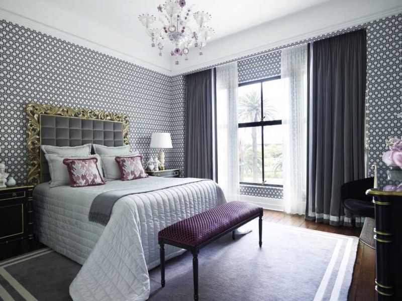
Ciemny, ale nie zawsze ponury — czerń w każdym obszarze wystroju wnętrz tworzy intensywny kontrast oraz posiada wiele walorów. Warto obejrzeć te 28 zdjęć i nauczyć się różnych sposobów na wprowadzenie czarnych zasłon do waszych domów w wyjątkowy i niepowtarzalny sposób. Czarne zasłony to najlepszy wybór dla podkreślenia dramatyzmu i wytworności pomieszczenia. Nie ma możliwości, żeby je przegapić, gdy są prześwitujące i nadają wpadającym promieniom słonecznym złowieszczy odcień. Czarne zasłony mogą również całkowicie blokować światło. Ich zdolność do wpływania na to, jak świeci światło oraz rekompensowanie braku koloru to potężne narzędzia. Czarne zasłony sięgające do podłogi, zwłaszcza te wiszące w salonie, mogą przejąć kontrolę i silnie wpłynąć na strukturę pokoju.
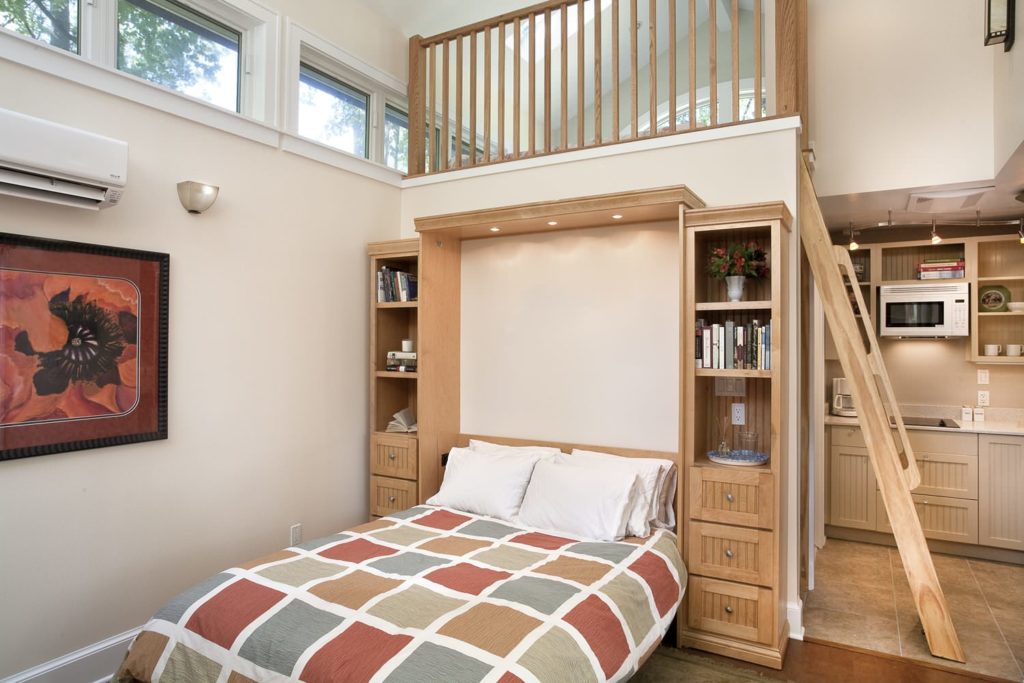
This very quaint and delicately styled guest house was created by ART Design Build and despite its small size, is both spacious and very functional. The exterior has a rather cute and traditional styling with really beautiful grey and white wooden panelling and the house also comes complete with its own sheltered patio. Inside, the guest house is really appealing, with a bright and open atmosphere that makes it seem bigger than it really is! The light colour palette and abundance of windows also helps the space to feel larger. The space has been well planned and thought-out and includes all of the facilities you would need to stay over on holiday or weekend trip. Photos Tsantes Photography. This is a stunning example of what can be done with a small amount of space, and gives you some excellent space-saving ideas. Photos by Tsantes Photography.
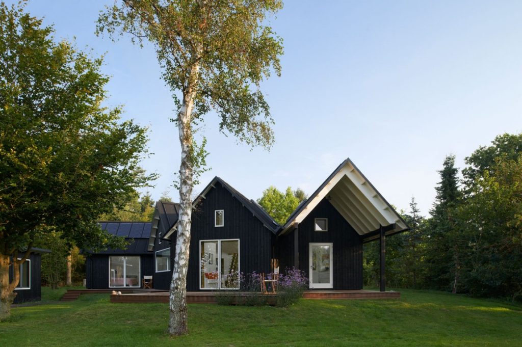
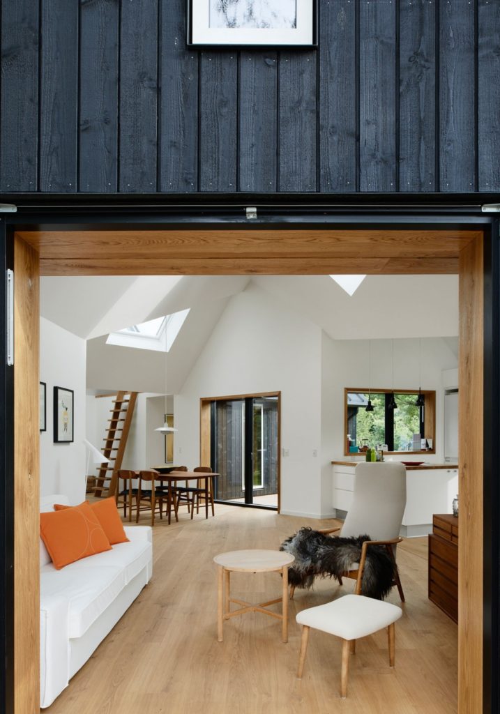
Looking at this house, you can see that it is not a conventional square shape, and does not have normal features. In fact, it looks a lot like five small chalets joined together to make one large house! With classic black wooden slatted exterior and cute white surrounded windows this house created by Powerhouse Company in Denmark is a stunning property to see. With this house, the owners each have their own re-treat and can easily get the feeling of being miles away from anything, just from nesting in a different wing. The central space of the house combines the kitchen and living room which is a beautiful touch as when the family want to get together all they need to do is meet in the middle of the house! The interior is simplistic and matches the spacious house that it resides in. What a fantastic idea!
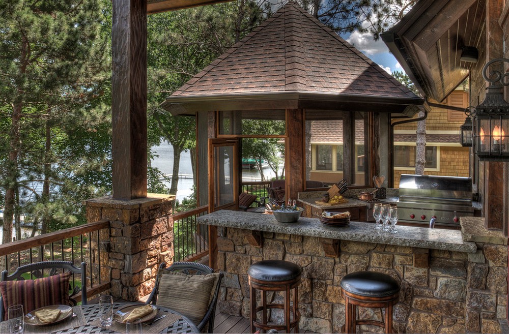
This huge, rather mystical looking house, is situated on a beautiful plot with an amazing backdrop of woodland areas and tall trees. It has stunning views of the lake from the front of the house and is located in the midst of rustic looking gardens. The exterior of the house is a perfect combination of natural stone and wood giving it a rather interesting, if yet almost medieval, look and feel. The large balcony area at the front of the house stretches nearly the full width of the house, giving the owners an amazing view of the lake and the mountainside in the distance. Inside, the interior is totally unique, with a rich and interesting atmosphere that adds to its very rustic style. There is a large amount of stone inside and outside the house and really gives it a homely, yet archaic feel. This luxury country house is located in Minneapolis, USA, and was developed by the American company Lands End Development.
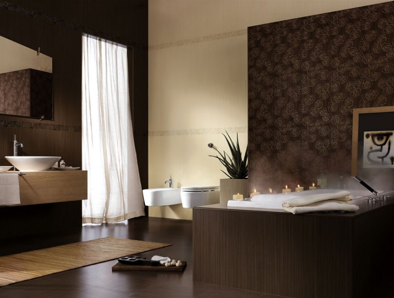
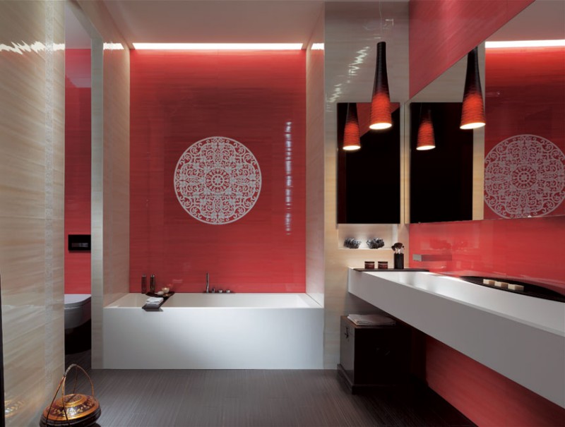
Цвет — это душа плитки, которую предлагает нам итальянская фирма FAP Ceramiche, вдохновляя нас красивым дизайном плитки для ванной комнаты. Эта плитка позволяет сделать абсолютно индивидуальный дизайн ванной комнаты. Она пробуждает эмоции и просто слепит энергией. Она обладает способностью преобразить атмосферу любой ванной комнаты в нечто захватывающее. Количество возможных вариантов цветов плитки просто бесконечно, от спокойных сливочно-желтых и бежевых тонов и вплоть до яркого фиолетового и красного. Это безусловно лучшая плитка для ванной комнаты, которую я видел до сегодняшнего дня.
