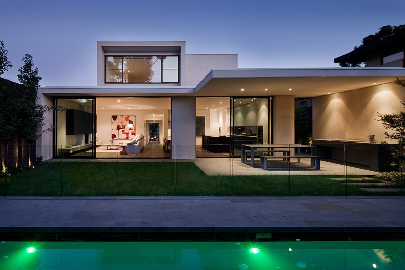
Tucked away in one of Australia’s premiere urban neighborhoods, style can’t help but to exude from this home. Starting with the front yard, a modern metal fence provides security and substance. The carefully planned pathway extends beyond the well manicured front lawn, into the breezeway, where the real fun begins. The living area, kitchen and dining room are fused together with a cohesive theme. Dark wood is found on the kitchen island as well as the dining room table. A huge walk-in closet is lined in the same coffee colored wood. Upstairs, a small home office and children’s room helps to lend credibility to this expertly crafted, modern Australian home. Swirled peach marble bathroom countertops are the finishing touch in this chic abode. Designed by Canny.
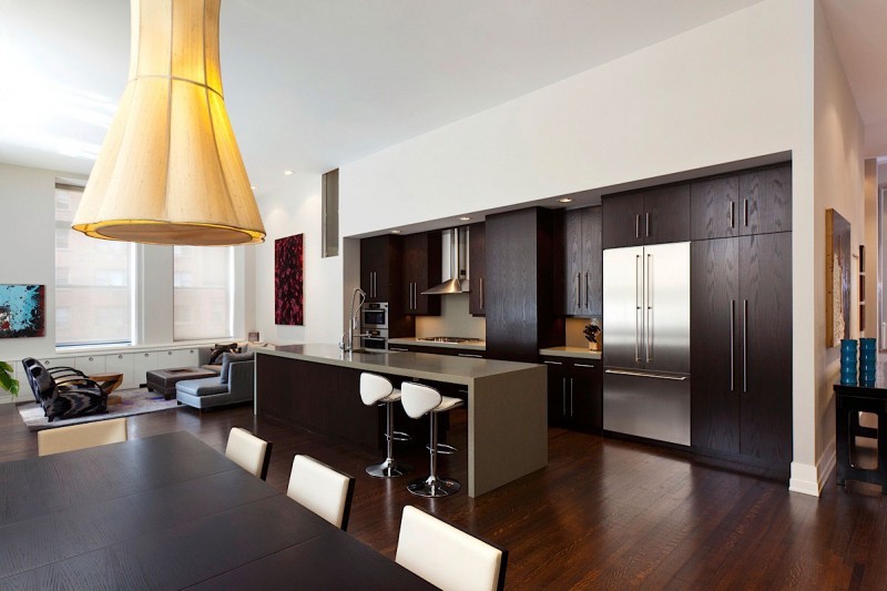
Building the perfect home for even the smallest of families in NYC requires patience and ingenuity. This collection of photos details the stunning details designer Guillaume Gentet was able to include in a Manhattan loft decorated for a family of four. The downstairs area has enough room to allow for a spacious kitchen, separate dining area, a sitting area and a home office, tucked away in a quaint corner. Above, the master bedroom suite holds a large set of double windows overlooking the city. Soft lighting, cool grays and warm earth tones make for a relaxing retreat. Mosaic tiling is used on the bathroom walls to transmit an earthy range of blues. The designer of this loft capitalized on the space available and made this home complete.
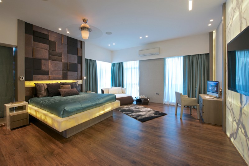
There won’t be any spaceships docking on this contemporary Mumbai apartment, but it is plain to see that some serious futuristic influences were hard at work during the design process. In the living room, recessed lights dot the ceiling. Between the recessed lighting appears dome shaped, chrome colored fixtures. A cut away ceiling design with rounded edges makes the room feel like it came from a different time and space. Neutral colored walls, carefully selected embellishments and bright, lively accents capture a futuristic feel without going overboard. A mature bedroom suitable for older teens and young adults houses a set of understated bunk beds. A small flight of stairs leads up to the top bunk, which sits atop a platform styled frame. There are just enough daring details in this Mumbai apartment to set it apart, but also varies key features that make it charming. Designed by ZZ Architects.
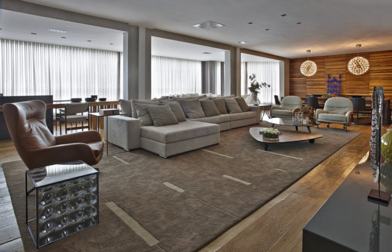
The subtly applied textures and cool ambiance of this Brazilian apartment remains unmatched. Much of the furniture would fit right in at a start-up company, but it is just as relevant within this space. David Guerra was hired specifically to create the interior design of this Belo Horizonte, Brazil, apartment, where he was able to take artistic liberty and try out new ideas. Art appears in various forms, from wall paints to vases to custom made furnishings. Art Deco inspired chairs rest in the kitchen, tucked neatly under a traditional dining table. Busy wallpaper patterns and tiles match the motif in the kitchen, balancing the warm tone emitted by the wood doors and tables with a sliding scale of grayish tones.
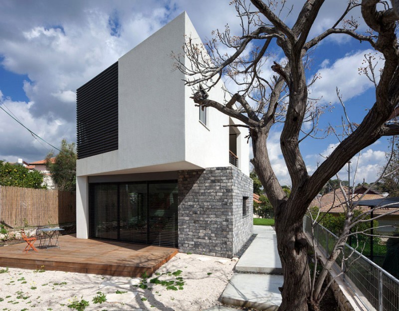
Yes, these pictures really do depict what appears to be two houses sitting atop one another. This design did not occur as a result of a natural disaster, but was deliberately constructed at the request of SO Architecture. Consequently, this home is much more cohesive on the inside than the exterior. Although there are plenty of windows, the designer choose to make use of Venetian styled blinds in order to control the lighting and mood. A three-panel sliding glass door on the lower level leads to a wooden deck, but it is also covered by a set of blinds. The interior of the home is reminiscent of a loft, with its vaulted ceilings and wide, open floor plans.
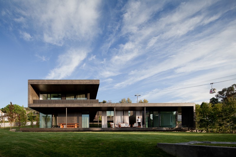
Tempered metal was used to line the outside of this expansive Portuguese home. Rolling fields of rich green grass can be found on all four sides, and even within the hollowed out square that makes up the shape of the house itself. Interior design firm Pitágoras Arquitectos emphasized length; the halls are long, the home itself is long and the indoor pool is also narrow and long. While foliage and shrubbery is utilized to create a tropical feel outside, things are kept more simple on the inside. Hardwood floor board, shined to a high-shine finish are seen in most rooms. Parts of this Portuguese home, such as the kitchen are kept dark and mysterious. Just one room over, the dining area catches natural light from outside while providing easy access to the large backyard space.
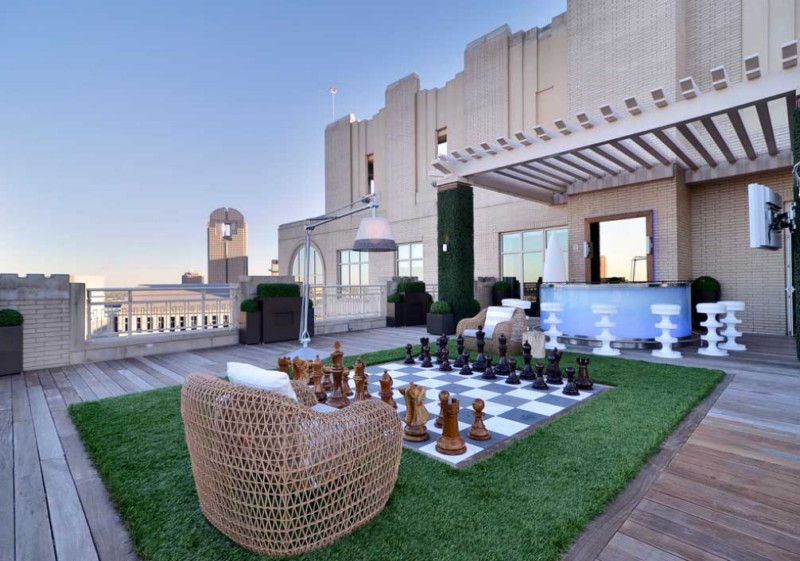
Whether large or small, the terrace can completely change the look and feel of a home. This group of pictures shows 19 varied ways that homeowners can address terraces, create their own unique styles and put different elements together in an effortless way. One terrace looks like it was created in a rock target, erected dead center of a manmade pebble path. Another backyard terrace has a wooden veranda, a geometric themed patio, plenty of seating and even an outdoor bar area. The picturesque veranda by the pool features a glass topped table, swivel chairs and oversized outdoor lamped with built-in storage. From the conventional to the unexpected, beautiful terrace designs come from the designers’ ability to focus on a place made for quiet enjoyment.
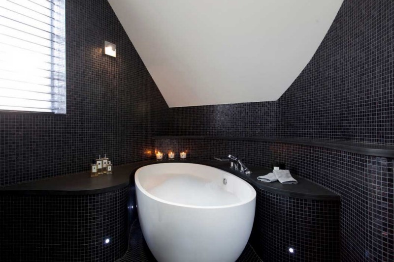
If white tiled bathrooms are quintessential to classic bathroom interior design, then black tiling must be the antithesis of bathrooms around the globe. Review this collection of 26 bathrooms that make use of black tiles in intriguing ways. Instead of using black tiles on the floor, one bathroom has a show stall completely lined in tiny black tiles flanked by hardwood floors. Black bathroom tiles of different sizes and shapes are used in a different bathroom. This treatment adds dimension to the bathroom, as well as an organic feel. Warm amber lights hang down in front of black bathroom tiles that are used solely on a single wall. The remainder of the bathroom is a soft white. Black tiling continues to further modern bathroom interior design elements.
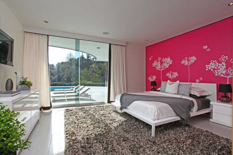
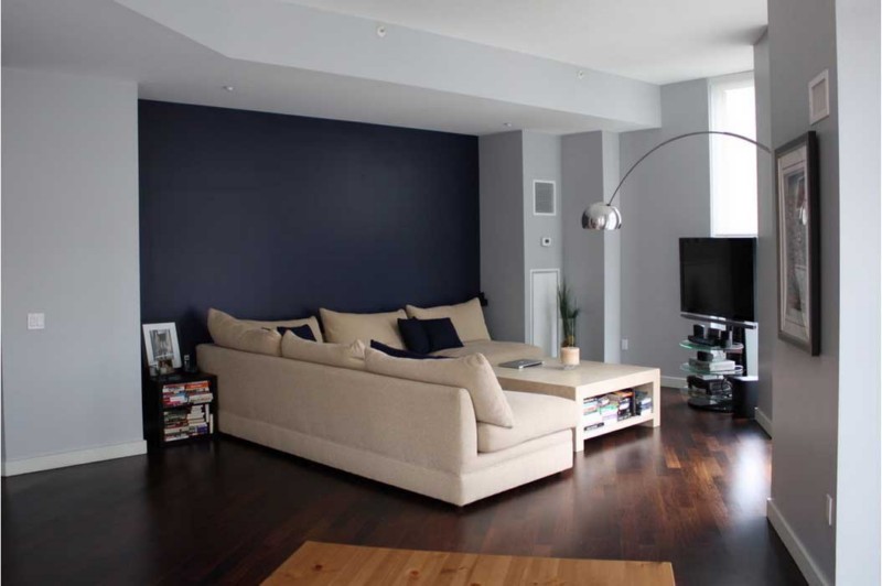
Simply by painting one wall in a room a different color, you can create and accentuate inventive styles. The ever present accent wall can be found in various incarnations, with some lined in copious amounts of paintings and prints, while others acting as a dressing screen. By applying wallpaper to the concave wall behind two twin sized beds, an accent wall pops right into position. The two hanging wreaths on either side of the beds ties in the bohemian-holiday vibe going on in the room. Accent walls behind mantles, beds and couches are also popularly, largely because they are difficult to ignore. Borrow ideas from the accent walls seen here and try out new interior design motifs you’ve secretly fancied for years.
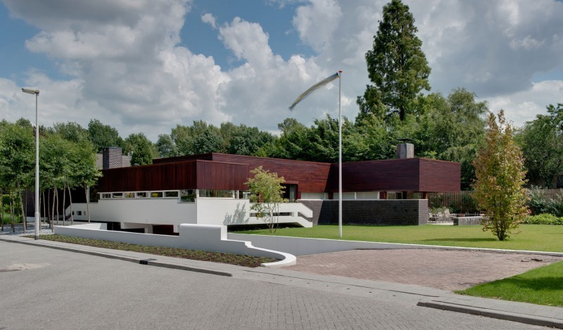
This collection of photos tells the story of a house with a unique story. Built several decades ago, the home has always had a transformative shape. This newest set of renovations, executed by Siebold Nijenhuis Architect include an earthen garden accented by narrow reflecting pools, a stone walled patio, brick and wood façade and museum-like interior. The library is flanked with shells, filling it from wall to wall. No chairs, tables or furnishings of any kind accompany the many books that stand at attention. A clean, modern bathroom features the rectangle, its shape ringing true throughout. Rectangular shaped double sinks sit until a long mirror. An unusually oblong wall cutout acts as the entrance to the shower housed in a rectangular shaped room.
